Selling a trip on the first screen
"Пора ехать!" is a licensed tour operator running its own trips across Russia and the Caucasus. In travel the decision is emotional, but the payment is made on facts. So the site delivers both at once: the view and a concrete answer.
Where we started
A pretty picture does not sell on its own
Travel is full of identical sites: the same mountains, the same "unforgettable holiday". People open several tabs at once and decide within seconds which one looks serious.
- Is the operator legitimate — that needs checking
- How many days, where to and what is included — the answer is needed now
- Winter and summer are entirely different offers, but there is one site
- Conversations happen in messengers, not on the site
View, proof and action — on one screen
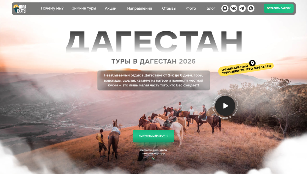
The destination name in huge letters over a real photograph. Beside it a badge with the register number — trust in one second. Below, the green button and the route.
- Trip length and what is included are stated in the hero text
- A video circle — "watch a film about Dagestan"
- Seasonal pages get their own art direction
- Telegram, WhatsApp, VK and Dzen in the header — one tap away
How the site looks
Home
A full-screen photograph with "ДАГЕСТАН" over it — large, semi-transparent, still legible. The copy sits on a dark translucent plate: the photo shows through and the text stays readable.
- A yellow badge: licensed tour operator and register number
- The green button — the single primary action on the screen
- The video circle on the right, with text running around it
- A "scroll down" hint at the bottom — the page continues
Winter tours
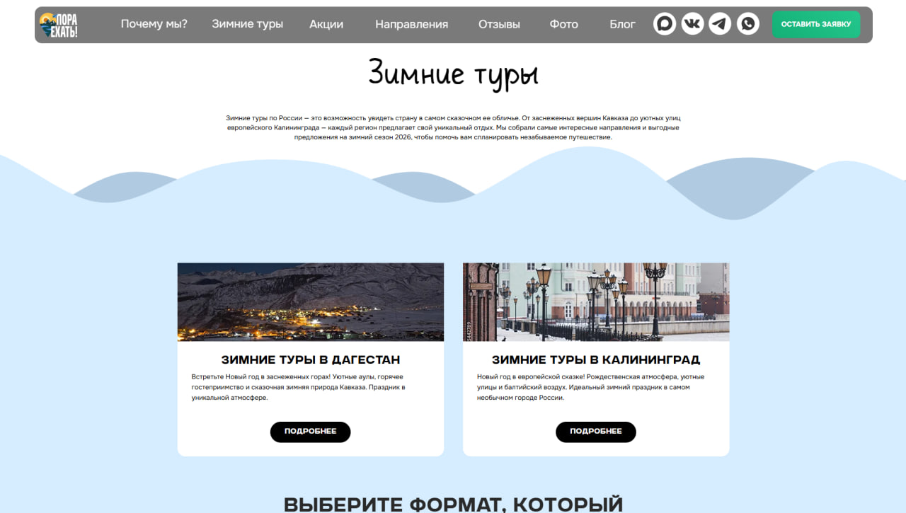
The seasonal page has a look of its own: a handwritten headline, a pale blue field and snowy hills. Not one template for everything — when the season turns, the mood of the site turns with it.
- Destination cards: photo, description and "more"
- Each card leads to its own page
- Below, a block for choosing the format — group or private
On a phone
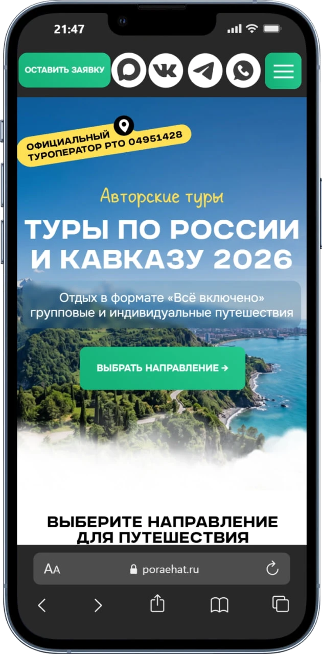
On a phone the order changes: the enquiry button and the messengers come first, the headline after. Most travel traffic arrives on a phone and wants to write straight away — that path was shortened.
- Four messenger icons stay permanently in view
- The register badge stays inside the hero — trust is not lost
- The green button runs full width, easy to hit with a thumb
What changed
The licence badge is on the first screen — nobody has to go looking for proof.
The winter offer arrives with its own page and its own mood.
One tap from the phone into a messenger — the enquiry does not get lost.
APEC Asia UAE
Open the case →ConsultingYakov and Partners
Open the case →Manufacturing · ERPVAC.UZ
Open the case →ERP + CRM + FinanceAvenir OS
Open the case →We will present your service the same way
No brief needed — write a couple of lines and we'll ask the rest.