Home/Projects/Yakov and Partners
A site that sells trust
Yakov and Partners is an international consulting firm of more than 200 people. In this market a site does not sell a product — it conveys the weight of the firm. Hence the brief: no noise, two languages, and the same restraint on a phone.
Where we started
In consulting a site is not a business card, it is evidence
Nobody comes here looking for a price. They come to check who the firm is, who it has worked with and which industries it understands. That is a lot of text, and it has to be laid out without confusing anyone.
- Many industries: metals and mining, oil and gas, construction, energy, banking, telecom, retail
- Publications, media appearances and the team — each its own section
- Two languages, the same quality in both
Restrained typography, clear hierarchy
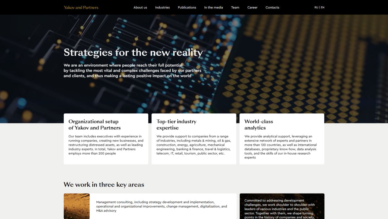
A dark hero and one strong sentence — it says what the firm does at a glance. Three white cards rise into it: organisational setup, industry expertise, analytics. The reader gets the main answer before scrolling.
- Serif headlines — the language of the consulting market
- Cards overlapping the hero start the page immediately
- The three key areas on the next screen — text and image in pairs
- The language switch sits at the right edge of the header, out of the way
How the site looks
Home
A full-height dark hero and a single line: "Strategies for the new reality". Three white cards push up into it — they cut the hero and take the page straight to substance.
- Organisational setup, industry expertise and analytics — three answers
- The "three key areas" block: text and image alternate
- Top bar: seven sections and an RU / EN switch
On a phone
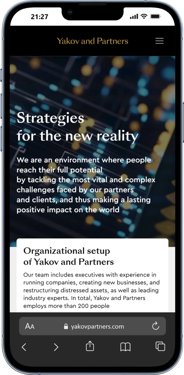
The hierarchy holds on a phone: headline, description, then the white card. Text is not shrunk or squeezed — it simply drops into one column and stays comfortable to read.
- The menu collapses into a burger, the logo stays centred
- The hero image is not cropped — the text reads over it
- The card runs full width, margins stay even
What changed
What the firm does and who it is — said on the first screen.
The Russian and English versions share the same structure and the same quality.
The mobile version is not a cut-down copy — it is the whole site.
DeFi Technologies
Open the case →E-commerceAPEC Asia UAE
Open the case →TourismDagestantur
Open the case →Manufacturing · ERPVAC.UZ
Open the case →Does your company need a site like this?
No brief needed — write a couple of lines and we'll ask the rest.