Home/Projects/DeFi Technologies
Explaining complex finance on one screen
DeFi Technologies is an institutional platform where traditional capital markets meet decentralised finance. The audience is investors and institutions. For them the site is evidence first: what the company does, where the money comes from and who it works with.
Where we started
The business model is hard to explain
The company runs validator nodes, applies MEV strategies, earns staking yield and issues investment products — all at once. Explain that in prose and it takes three paragraphs, by which point the reader is gone.
- The audience is institutional investors with little time
- Several subsidiaries, each with its own brand
- Financial results come out regularly and have to be visible
One sentence, one diagram
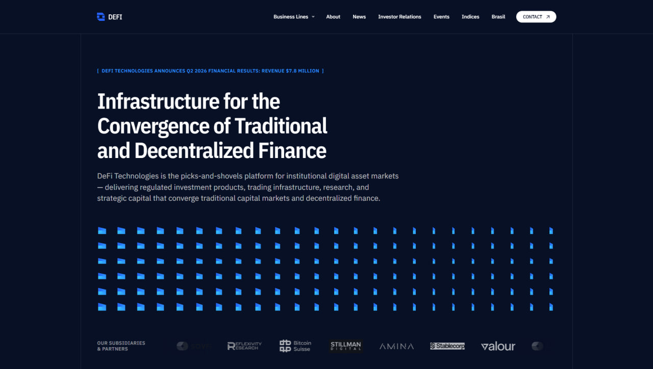
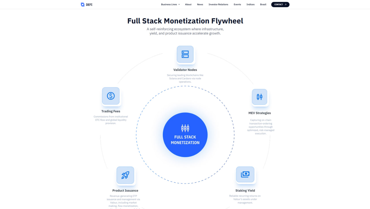
The first screen carries only a strong headline and a short note. The model itself lives in its own block as a circular diagram: the shared idea at the centre, five revenue streams around it. It lands before anyone reads.
- The results line at the top — the first signal for an investor
- Subsidiary and partner logos build trust immediately
- The diagram block is deliberately light — on a dark page it stands apart
- On a phone the diagram unfolds into a list
How the site looks
Home
A dark, almost black background and a large grotesque headline. At the top, a line about the latest financial result: an investor knows what to look at within a second. A row of subsidiaries and partners below.
- The headline breaks over three lines — the reading rhythm holds
- The grid of blue glyphs fades to the right and never fights the text
- Eight logos in one row, in grey — no noise
The monetisation diagram
The most important block on the page. "Full Stack Monetization" at the centre, five streams around it: validator nodes, MEV strategies, staking yield, product issuance and trading fees. Each explained in one line.
- A light background — on a dark page this reads as its own chapter
- The dashed circle shows the ecosystem is a closed loop
- Each node carries its own icon — it reads without the text
On a phone
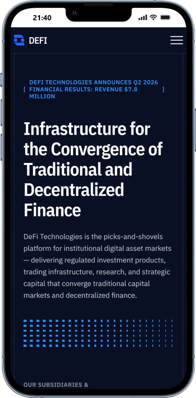
On a phone the headline breaks into five lines but keeps its size — it is the site's main voice. The results line stays on top and the glyph grid tightens.
- The menu collapses into a burger, the logo stays on the left
- Text runs full width — it never splits into two columns
- The subsidiaries block moves down and becomes a vertical list
What changed
Five revenue streams on one diagram — no reading time needed.
The financial result and the partner logos are visible at once.
On a phone the headline and the structure keep their weight.
Yakov and Partners
Open the case →E-commerceAPEC Asia UAE
Open the case →ERP + CRM + FinanceAvenir OS
Open the case →TourismDagestantur
Open the case →Need to explain a complex product?
No brief needed — write a couple of lines and we'll ask the rest.